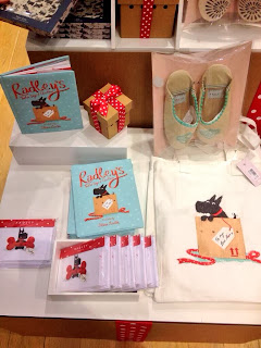
The book project was born largely from Nosy Crow's collaboration with John Lewis on their 2012 'The Snowman's Journey' picture book based the christmas advert of the same name. For this, Nosy Crow had managed to design, print and deliver a beautiful picture book within a matter of days. Radley, being one of John Lewis' concessions had heard about this amazing turnaround and approached Nosy Crow with the idea of creating an exclusive, stylishly charming christmas picture book within a short space of time. Kate Wilson suggested a new take on the classic christmas song 'The Twelve Days of Christmas' and the creative teams of both Nosy Crow and Radley and myself got our heads together and worked out the look and feel of the book.
Below is a visual diary of the process we went through to design the finished book which publishes on this very day, 1st November 2013.
First came the character design for both protagonists, Radley the dog and the True Love.
The True Love character was trickier to get just right, as human characters often are. It was very important that the young lady in the book had a sense of style in-keeping with the Radley aesthetic whilst maintaining an appealing children's book character. It took time, but we got her in the end;
Her clothes we key and the teams at Nosy Crow and Radley sent me many mood boards and fashion ideas to help create the perfect 'Radley Girl';
Eventually we got the balance between character, clothes and pose just right and here she is!
With the characters, style and overall feel of the book decided upon, it was time to start laying out the pages. In an early meeting, Camilla Reid the Editorial Director from Nosy Crow had created some rough but perfectly formed layouts which I took my (dog) lead from.
It was a help that the text was incredibly solid - The Twelve Days of Christmas is a great, fun song full of repetition and rhythm - the only problem that faced us, well Stephanie Amster, lead designer at Nosy Crow was the increasing amount of words on each page - as you can see below - the text grows and grows along with the amount of gifts the True Love receives!
Then once everything had been agreed by both teams over numerous bottles of water, packets of biscuits and handbag discussion (can you spot how many Radley bags are in the book…) it was time for me to scan in my drawings and start tweaking, adding details and COLOUR - all during the hottest days of the summer!
Using Photoshop I built up layers of pastel-styled colour until I was happy. We all decided the palette in this book was really important - a slightly muted, stylish range of colour and textures was the order of the day…and here are two of the finished pieces;
So just a few weeks later we had a full set - 32 coloured pages, title pages, end papers and eventually a cover - beautifully put together by Steph who is the MASTER of the beautiful book spine!
£2 from the sale of every book is donated to the Kids Company children's charity which I am really thrilled about as this charity does so much for children in need of help and support - especially at Christmas time.
Special mention has to go to the wondrously talented Yasmeen Ismail who created the beautiful ribbon-styled text for the cover.
A huge thank you to everybody involved - it really was a pleasure to work on and I think we all relished the challenge of the incredibly tight deadline - the quality of the book certainly hasn't suffered as a result! Oooh and did I mention it has spot UV on the cover to give it that special Christmas magic!
That wasn't the end though - then it was marketing time! With my background in animation and my directional relationship with Picasso Pictures (where I am currently directing the Holland & Barrett commercials plug, plug) everyone agreed that it would be lovely if we could create a couple of book trailers. So it was literally back to the drawing board to create some simple storyboards…
Once the boards were signed off, I created an animatic (the filmed version of the storyboard with a few moving bits and pieces, camera moves etc) for each trailer. I then passed this over to Melissa Venet, senior producer at Picasso Pictures and Linda Kalcov who created the beautiful animation of Radley - Linda really brought him to life!
Here is a screen grab from part of the animation process - adding the texture in After FX;
And today (1st November) the book was published and is available online and in-store at radley.co.uk
Here are some photos of the beautiful stores in Covent Garden, Bath, Cambridge and Cheltenham - it's so exciting to see our characters and ideas in actual windows in actual shops in actual cities!
WAIT - don't go yet!!!! One more thing I nearly forgot to tell you.
There is a little Robin hidden somewhere on each double page of the book - happy Robin spotting!
And finally a special thank you to my parents who put up with me working throughout our Cotswold holiday in the intense heat of the hottest days of the year - love you lots x


This was lovely to read. Thanks for sharing, and for being so talented!
ReplyDelete